Triumph US Cross-Platform Website
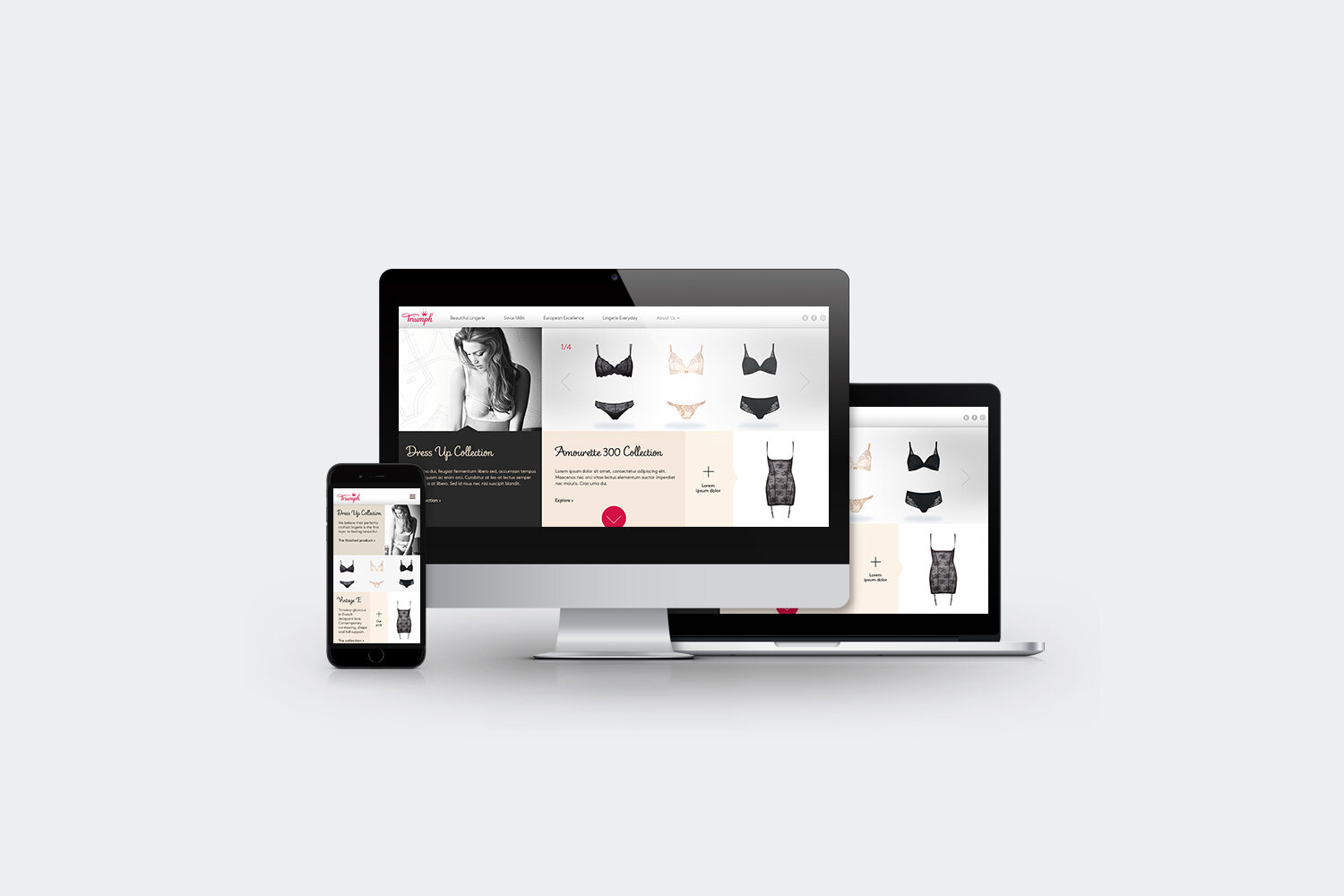
To commemorate their rebrand, Triumph was looking for a fresh look and feel for their US website. This redesign was received so well by Triumph that they requested further projects for us to craft, including a series of lookbooks showcasing their latest seasonal offerings.
Responsibilites
Design
Agency
Exposure
Challenge
Triumph’s US website needed modernising to be brought into alignment with their new branding. I was tasked with defining how this would be shaped to uplift the user’s experience.
UI Design
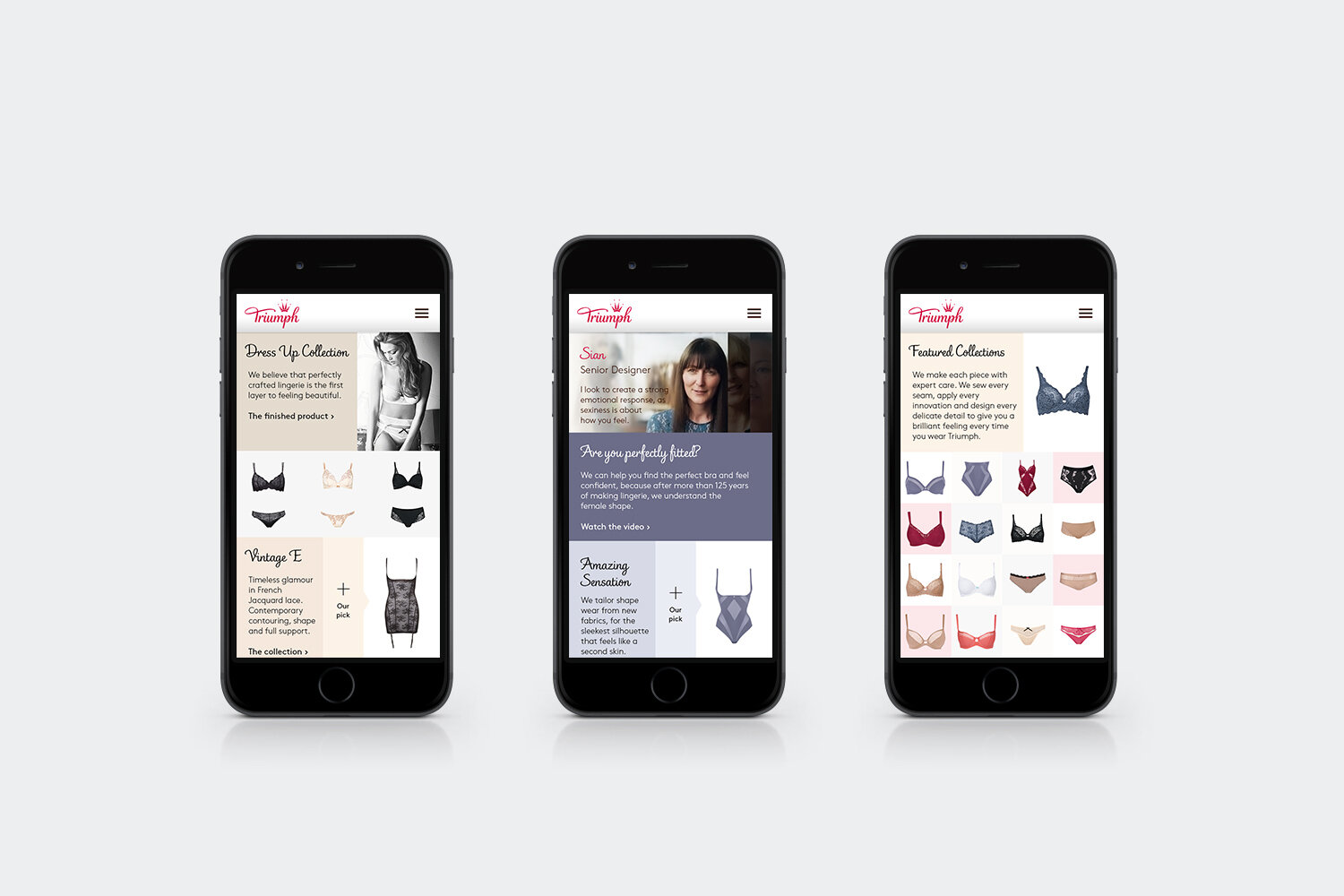
I decided upon a clean aesthetic for the site for ease of use and to showcase the luxury of the brand.
I incorporated elements such as large impactful imagery to hero the products, along with visual cues help guide the user through the site. I also included large dropdowns to facilitate having important information such as the opening dates of stores readily accessible.
Careful use of colours was incorporated to align with and complement the products, and stackable modules were included to facilitate the transition of the designs in a cross-platform environment.


