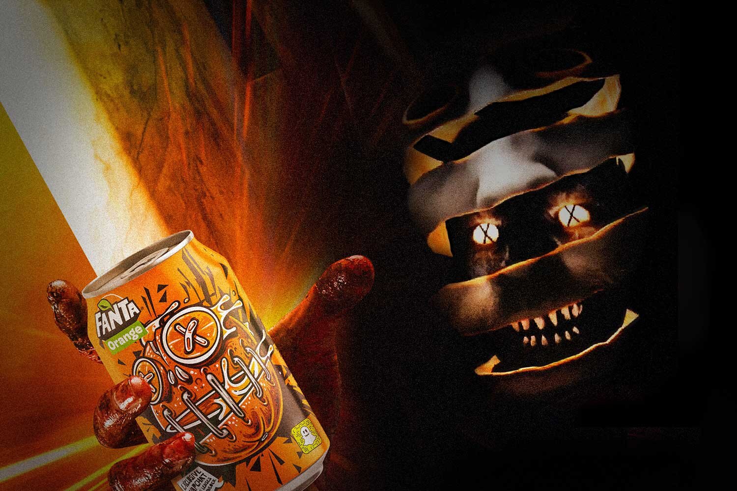
Fanta Halloween Campaign: Too Dark
Fanta wanted us to help them become synonymous with Halloween in the same way that Coca-cola is with Christmas. The launch of their new product - Fanta Dark, gave us the opportunity to ask the audience if Fanta had gone ‘Too Dark’ with its 2019 Halloween activity.
Responsibilites
Design Lead, Motion Design
Agency
Movement
Challenge
Our task was to set up a campaign that consisted of OOH / DOOH and instagram content to promote Snapchat lenses that could be unlocked from Fanta products.
OOH/DOOH Design
We decided that a more chilling design language would help to make this campaign stand out and perfectly align with the Fanta Dark branding. Dark, grainy imagery and illuminated typography seemed the perfect fit to attain user attention.
Within the team, it was my responsibility to help create KVs to promote the Snapchat lenses. I also oversaw brand consistency and the translation of the designs from digital to print format.
Motion Design
I created a series of animations that would appear on social media platforms to assist with the promotion of the Snapchat lenses. The imagery and footage for the campaign was created in-house, and I was on set to provide technical guidance for this.
Achievements
41 years
of cumulative lens usage
57 second
average AR lens playtime
3 million
snapchat codes scanned
9%
sales increase in 14 European markets during Halloween period

