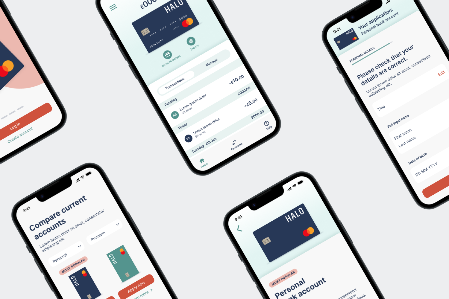
Halo Banking App
Setting up and managing a new bank account online can be quite a daunting experience. Halo’s aim is to address this with a user-friendly way to onboard its new customers.
Role
UX, UI
Responsibilites
UX research, IA, Wireframing, Lo-Fi and Hi-Fi Prototyping in Figma
01
Comparing accounts to decide which one best suits the user’s needs.
02
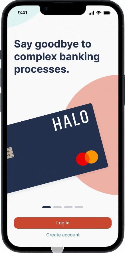
Applying for an account and filling in personal details in a digestible format.
03
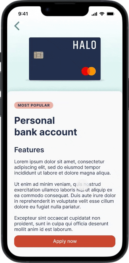
Giving the user the opportunity to review and edit their personal details before applying for the account and confirmation of account having been set up.
Home screen and menu functionality.
Understanding the Challenge
The main consideration was finding a way to effectively streamline the process of selecting, setting up and managing a new bank account online.
I wanted to create a genuinely useful and valuable experience for the user. As such, it was essential for me to first gain an understanding of the user before beginning the concept phase.
I used the iterative process below to gain empathy for the user and keep their needs at the forefront through every step of the design.

Understanding the user
I interviewed 5 people within the 18-70 age range from different walks of life. I used the information from this to help get an idea of their pain points and to develop the following two user personas.

Information Architecture
To gain further empathy for the user, I hypothesised user flows and from this established the navigational structure of the app with a sitemap.

Paper Wireframes
I drafted different iterations of each screen by hand as a quick way to ensure that the elements used in the digital wireframes would effectively address user pain points.
For the account comparison page (shown below), I prioritised a simple layout to keep the information easy to digest for a mobile screen.

Digital Wireframes
After reviewing the paper wireframes, I took the elements that seemed to work best and from these I constructed the digital wireframes.

Based on feedback and findings from user research, the initial design phase focused on an easy to understand format within a small screen size.

Setting up the user’s account quickly and easily was a key user need to address. The application process was split into segments to help achieve this.
Lo-Fi Prototype
After reviewing the paper wireframes, I took the elements that seemed to work best and constructed the digital wireframes.
User flow for reviewing account types, selecting one and then once created account, going to the homepage and opening the menu for more options.
Usability study
Following the creation of the low-fidelity prototype, I conducted a moderated usability study to gain insights on how usable and useful this app would be.
My key findings were:
1. Users want a way to review their details before confirming their account to be set up.
2. Users want more consistent language on CTAs.
3. Users want a progress bar when filling in their application details.
Visual design
When considering the visual style of the app, I chose teal as the primary colour because of its association with being trustworthy and giving a sense of forward progression and stability. It is also believed to promote a sense of tranquility, which I thought would be helpful with reducing the stress that might arise with fulfilling banking tasks.
I used a complimentary accent colour for the CTAs to make them easier to locate, and to increase accessibility I followed the WCAG for sufficient colour contrast.
I wanted to maintain a clean look and feel throughout the design, so I included tones of the primary colours as a gentle reference to the branding.
I also used Gestalt theories such as similarity, proximity and common region to group the elements in meaningful ways for the user.
I combined all this into a sticker sheet to form the initial basis of the design system. This was to ensure that all the elements would remain consistent throughout the designs, reinforce the brand identity and to help streamline the work flow.
